Who are you?
Simon Roberts, a London based animator and designer.
A big part of my day job is using design and animation to make complex things more comprehensible – through this project I’m applying these skills to photography.
Why have you made this?
In 2012 Sony published the results of a survey that claimed that ⅔rds of non-professional DSLR users never or rarely took their camera out of full-auto.
While there are some good resources out there (and there are certainly better photographers!), anecdotally and the results of this survey suggest these resources can be improved upon.
Problem to solve
The initial learning curve, when learning photography outside of automatic modes, is surprisingly steep. Many elements to learn are not too complex individually but when intertwined they get confusing.
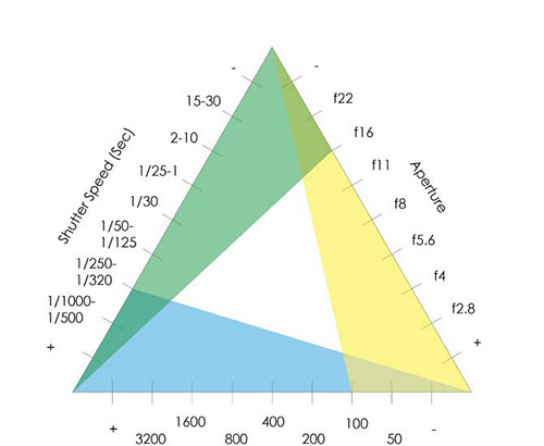
Triangles, setting a bad example
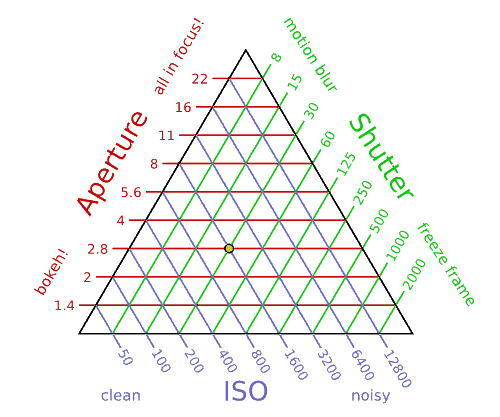
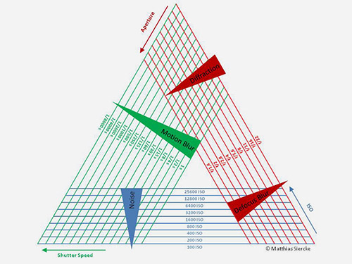
As an example, it's common to explain exposure using the "exposure triangle". The idea is that as there are three factors involved in exposure (aperture, shutter and sensor), and a triangle has three sides, a triangle can be used to explain exposure.
Unfortunately triangles have nothing in common with exposure.
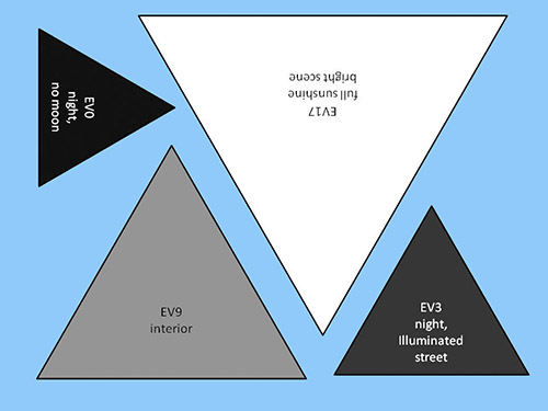
Some try to add more meaning to the triangles, but these additions create more confusion than explanation. What’s more, even the 3 sides thing adds confusion, as a fourth element - light in the scene - also affects exposure.
The exposure square anyone?
What’s your solution?
Create some simple tools to help you get the big picture and understand what’s actually going on.
Skip the metaphors
Metaphors are great but if you can explain the thing itself well enough, you can remove a layer of abstraction.
I’ve tried to show what’s happening so you can build up a simple mental picture about WHY various settings change your image, as much as WHAT they do to your image.
Simplify
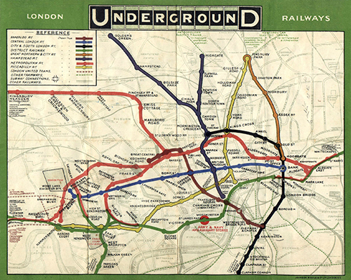
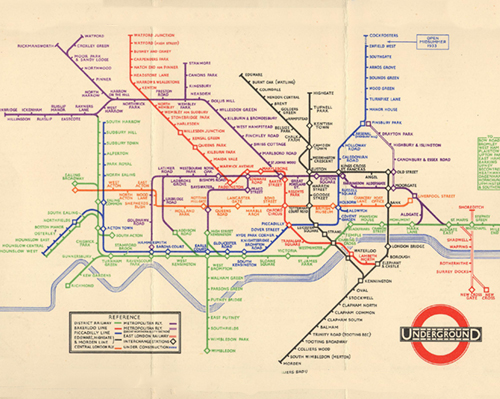
Early inspiration came from Harry Beck's London Underground map – It's a classic piece of communication design.
Beck's genius was to sacrifice geographic accuracy to allow him to simplify the map. He realised that while the geographic information was useful to a small group, for the majority, who just wanted to navigate between stops, it only added visual clutter. His map proved an instant hit, is the basis of the modern tube map and has been emulated around the world.
This was the sort of thinking I wanted to try to emulate.
Get the big picture
The idea of a map is a useful one. A diagram, like a map, helps you piece everything together, it helps you get a mental picture of what is happening and how things connect.
Time and interaction
The last thing that very few resources are able to show is time. Photography is a time based process – there is a sequence in which things happen. This was something I felt I could add, that would be much more than a gimmick.
What have you made?
So far I’ve created two diagrams that work together: an interactive tool to explore; and a graphic that adds depth and can be used to memorise key terms and figures.
Printed Graphic
The graphic was the first element created. It took a long time to craft the right balance of content, words, diagrams & layout that communicated things as simply as possible.
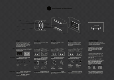
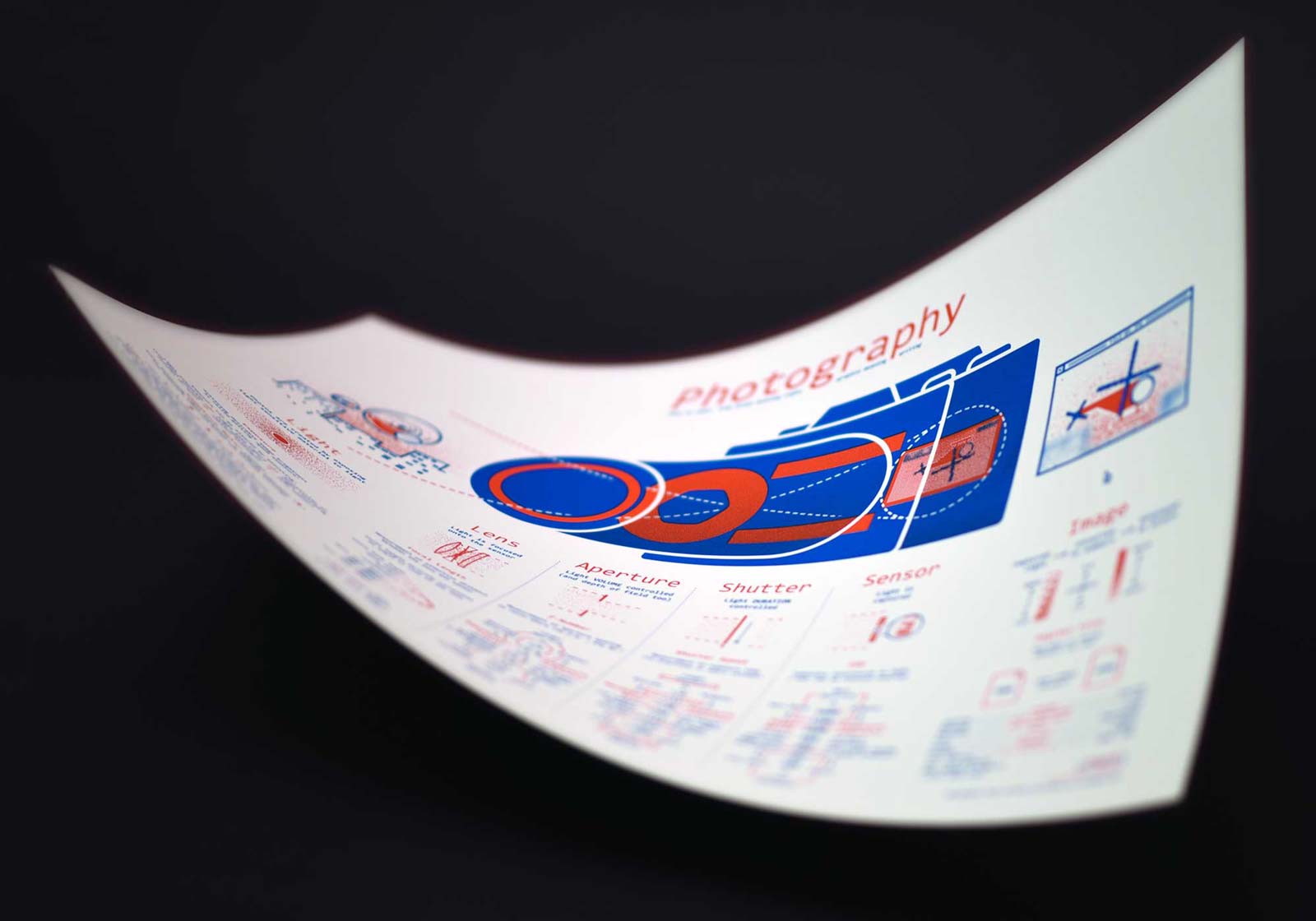
To give it the finish it deserved I wanted to screen print it. Screen printing allows for solid vivid colours to be printed and makes it something special.
Interactive Graphic
I adapted this design into an interactive diagram to help you explore the connections yourself. There are a total of 23,814 different photo combinations you can take (although most of those are either very overexposed or underexposed).
(it is built using JavaScript and an SVG library called snapsvg.js).
What’s next?
I have several ideas for new tools and resources that I'd love to try to make, as well as improvements I could make to these. I’ll see if there's momentum.
other people's expertise?
While I've received some invaluable help and advice from people while making this, it's currently only me working on it. If it goes well I'd love to be able to get other skilled people more involved to add their expertise.
Contribute
If you have any feedback to give, I'm very open to receiving it. Use this google form or email me at simon@photography-mapped.com
Follow
If you want to be part of this journey and hear more when new content is released, sign up below ↓ to receive occasional updates.